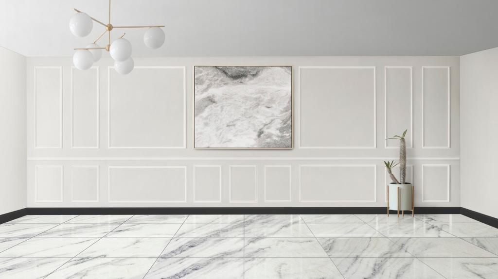

Light as a Color Partner: Daylight, Bulbs, and Shadow Play
North-facing rooms cool colors; west-facing rooms warm up dramatically at sunset. Test swatches across the day, noting shifts. If evenings matter most to you, prioritize the scheme then. Comment which orientation your room faces for tailored advice.
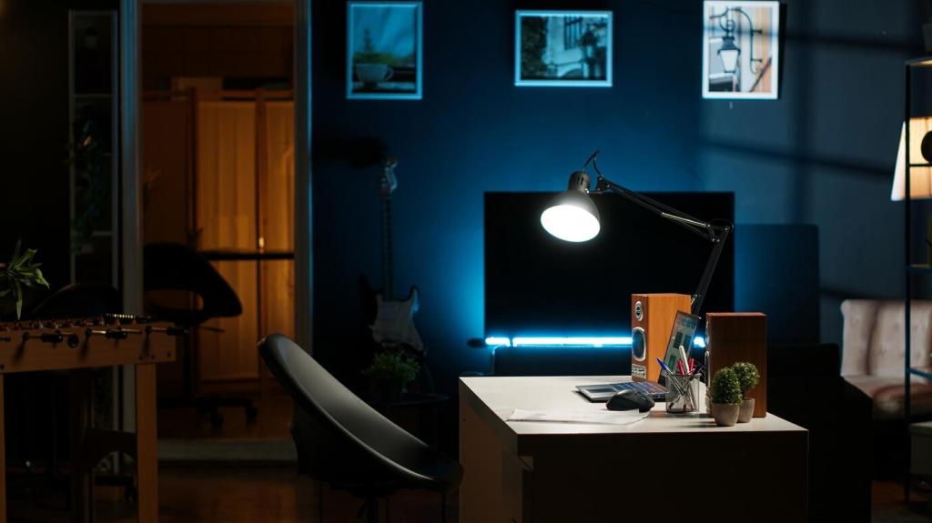
Light as a Color Partner: Daylight, Bulbs, and Shadow Play
A 2700K bulb softens edges and warms grays; 4000K sharpens details and can turn beige slightly dingy. Align bulb temperature with your palette intent. Share your current bulbs, and we’ll recommend a color-friendly lighting update.